
Frog and Toad
Titmouse Animation
June 2021-October 2022
Job Title: Art Director
The episode “Ice Cream/ A Lost Button” was the first episode developed for “Frog and Toad”, and many of the materials created for it were used as guides for later episodes. I created colorscripts, custom brushes for all background design and paintings, a plant and lanscape library, a plant map, character sketches for Frog and Toad, and chose colors for all primary character
Art Direction by Keika Yamaguchi
The episode "Ice cream / A Lost Button" was the first developed for "Frog and Toad", and many of the materials were used as guides for later episodes. For the episode and all the rest of the episodes , I created colorscripts for both segments, custom brushes for all background paintings, a plant and landscape library, a plant map, character sketches for Frog and Toad, and chose colors for all primary characters. She created images to established guidelines for line work, color and value separation, how to use the custom brushes, camera angle and depth handling, mood, and style.
RESEARCH
While carefully analyzing all 4 of the children’s book series “Frog and Toad”, I did extensive research on the creator, Arnold Lobel. In order to honor the style of the book series and how “Frog and Toad story was born. My research included searching and reading interviews with Lobel. These also helped me understand his philosophy, upbringing, and thoughts that went into his art making.
Character Concept
Below are Frog and Toad character sketches from the show’s proposal are based on “Frog and Toad are Friends” and “Frog and Toad Together” by Arnold Lobel. It was important that the characters have distinct visual identities which is why I chose to use the first two books as reference material— “Frog and Toad are Friends” and “ Frog and Toad Together”

Camera Angles & recreating stills from the books
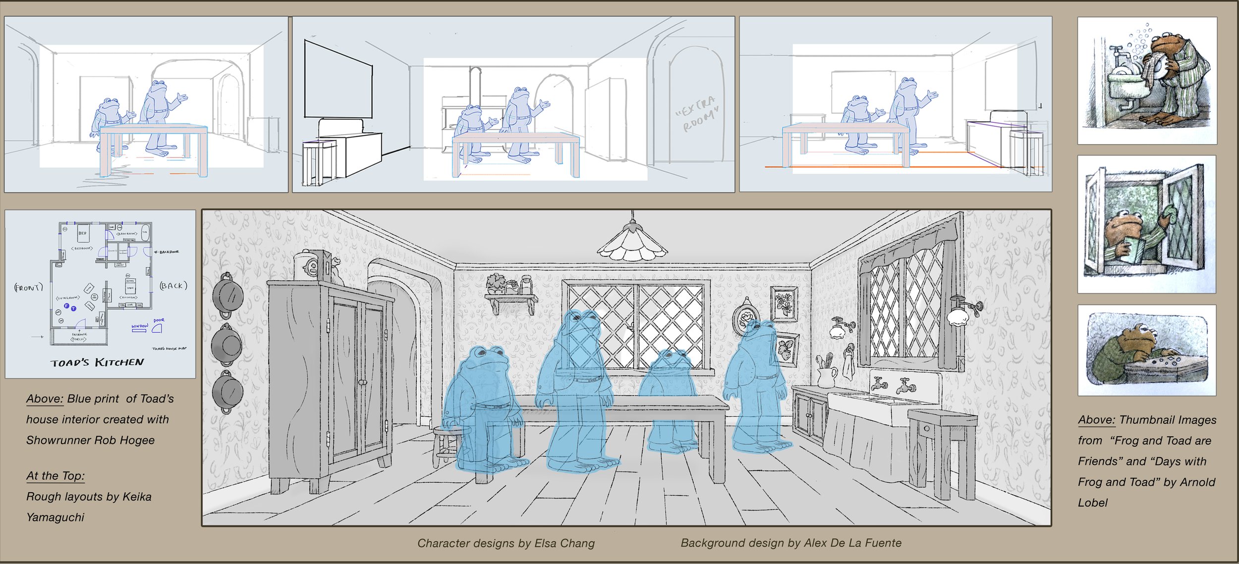
Showrunner Rob Hoegee asked with determining the master “camera angle” of the show, rather than leaving it in the hands of episode directors. I created this peice to establish this master “camera angle” and communicate how to handle depth and layering. It was important to her that Frog and Toad feels small in their environment. We also made sure when going into production that we capture the essence of the original illustration stills from the books whenever possible in hopes of people being reminded of the books
For the proposal, I also created a drawing of Toad’s house to communicate the sense of awe and discovery I wanted viewers to have while watching the show. I showed it to the background designers as an example of how to use scale, value, layering, and perspective to achieve this effect.


It was one of my goals for the show to feel naturalistic and give a sense of awe. One of the ways we tried to achieve this is by showing the passage of time with changes in the background plant life. I drew the sketch on the left as a guide for background designers, and ensured the plants in reoccurring settings would have a version for the different times of day.

The plant map below was the basis for the composition of the show’s biomes, ensuring a unique look for each area. The image was created with help from visual development artist, and later background designer, Nicole Gustafsson.

On a trip to the East Coast, I took nearly two hundred photos of plants and landscapes. I also gathered reference photos of flora from around Lake Bomoseen, a place that Arnold Lobel visited throughout his life and cited in interviews as a direct inspiration for Frog and Toad. I combined these two sources to create a plant and landscape photo library that the design team referenced in every episode.

After much development work, The piece I illustrated below was chosen to establish the color and style of the show. The custom brushes and pens for it were also used for backgrounds in every episode. The custom brushes and pens she designed were directly based off of her careful analysis of Arnold Lobel’s drawings.

Style guide
To illustrate the importance of hand drawing backgrounds without purely-straight lines, and to establish the 1910 through 1930s inspired interior, I directed background designer Alex De La Fuente in creating this first drawing of Toad’s home. From my analysis of Arnold Lobel’s books, I determined that the interiors were inspired by that time period, possibly due to the author being raised by his grandparents. Here are also excerpts from style guide I put together for the design team in Vancouver, created with help from the production coordinator Rachel Wiggins, Line Producer Sammy Rivkin and Antonio Canobbio, Creative Director at Titmouse Inc.


AFTER VISUAL DEVELOPMENT
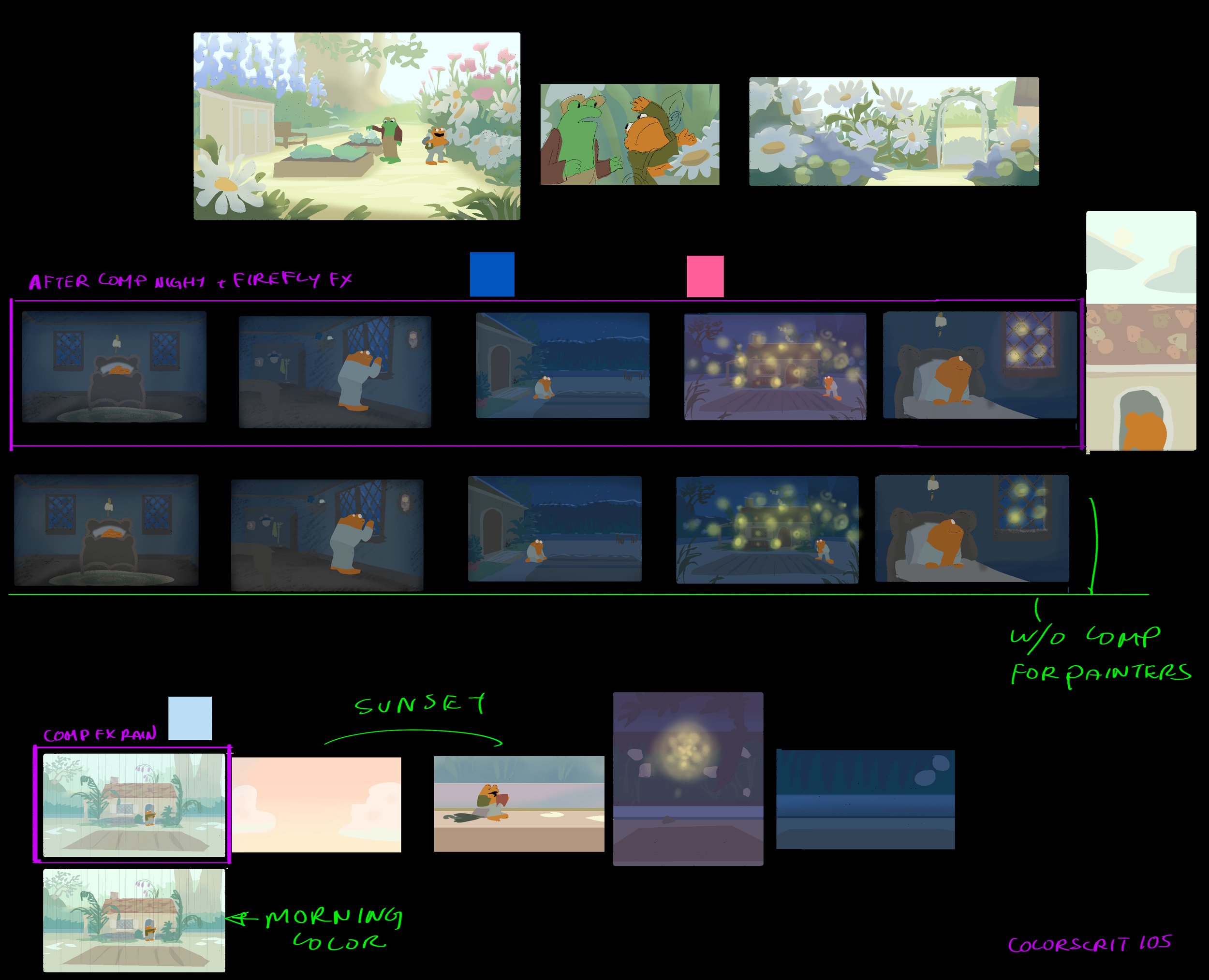
COLOR SCRIPT for “Ice CreaM“
The colorscript for the “Ice Cream” episode was the first created for the production and set the colors for Frog, Toad, Snail, Robin, Mink, Raccoon, and other characters. The colorscript also established how to handle the value separation of the environment including the sky and ground, how to handle the green of Frog versus the green of the plant life, and how the vibrant colors would be set against a paper-like background. This early colorscript were also used as a guide for how to handle the different times of day in the show.


FINAL Character And Color Designs
I made sure the design team pay attention to scale, proportion, and anatomy of different specials of characters, as well as taking guidance from Arnold Lobel’s drawings across all of his books. It was important to me that the characters had a sense of realism as related to Lobel’s visual language, as opposed to a standard fantasy or cartoon animal. I created this scale and character guide with art from character designers Elsa Chang and Jean Wang. Miguel Marcias applied all the colors inspired by the color scripts I created per story and the books while making sue all of them standing out well from the colored background paintings. We also made sure all the characters colors look like they belong in the same universe.

More ColorScripts


Please Check out these Amazing Artists I worked with!
Character Designers: Elsa Chang, Jean
Other Color Designers: Miguel, Heejin Park
Background Paintings: Nicole Gustafsson, David Merritte, Patrick Bryson, Amanda, Morgan, Shelly
Background Layout: Alex De La Fuente, Pat, Amanda Lapid, Yusra,
Prop Designer: Claire Duffy
And many thanks to :
Executive Producer: Rob Hogee
Overseas Art Supervisors: Breanna, and Oso
Supervising Director: Sarah Johnson
Directors: Cheyenne Curtis, Alex
Line Producer: Sam Rivkin
Production Mangers: Rachel Wiggins, Adrean Register, Rowan
Creative Director: Antonio

Looney Tunes Cartoons
Worked as Assistant Art Director, Background Painter, and Color Designer

The Adventures of Rocky and Bullwinkle
Worked as Color Designer

Coming soon…
Worked as Assistant Art Director
Thank you for viewing!
I am an illustrator of children’s books as well. I have few Vis Dev work available to view on this website. Please check them out if you’re interested. I am most proud of Teeny Tiny Toady and Puddle Pug.